
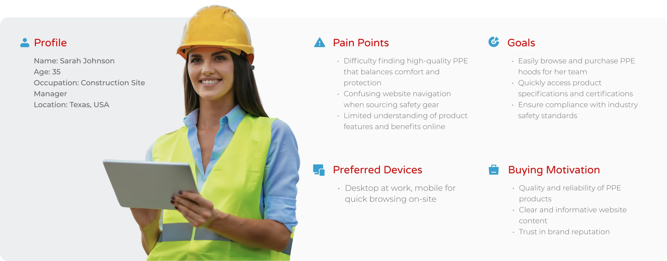
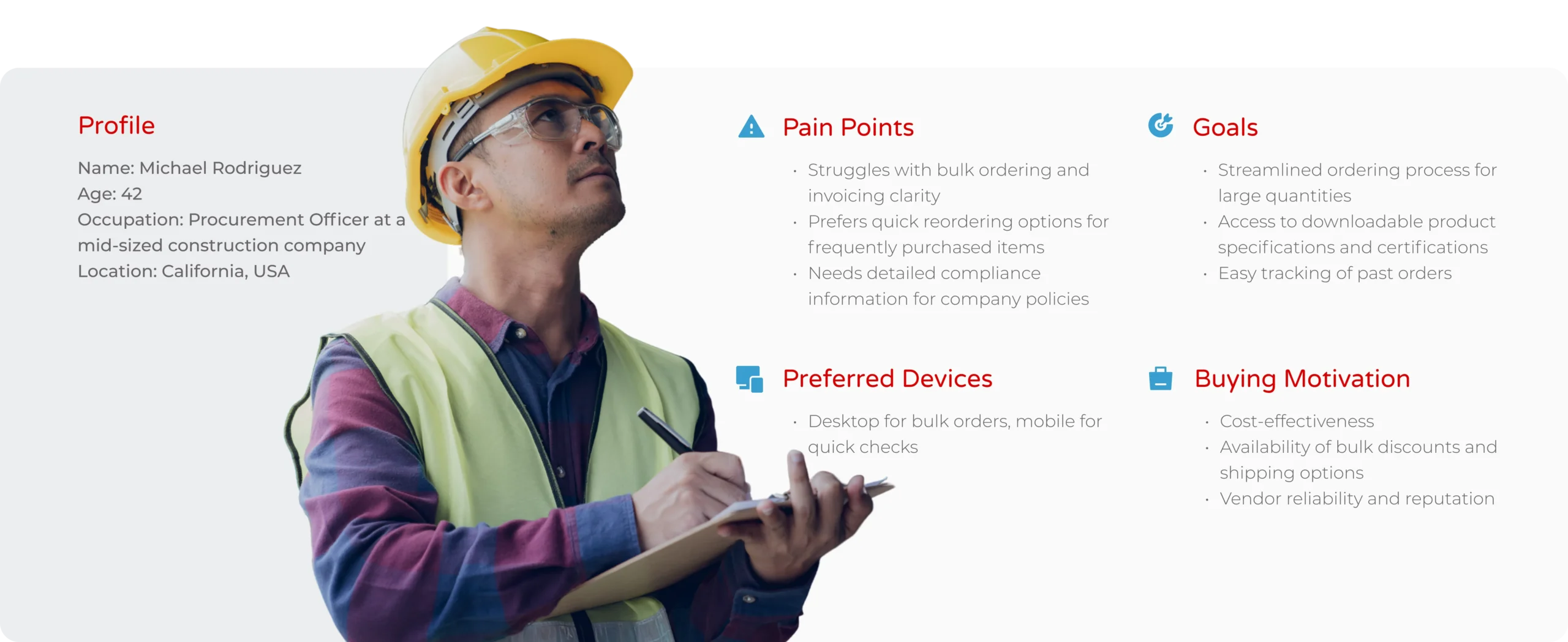
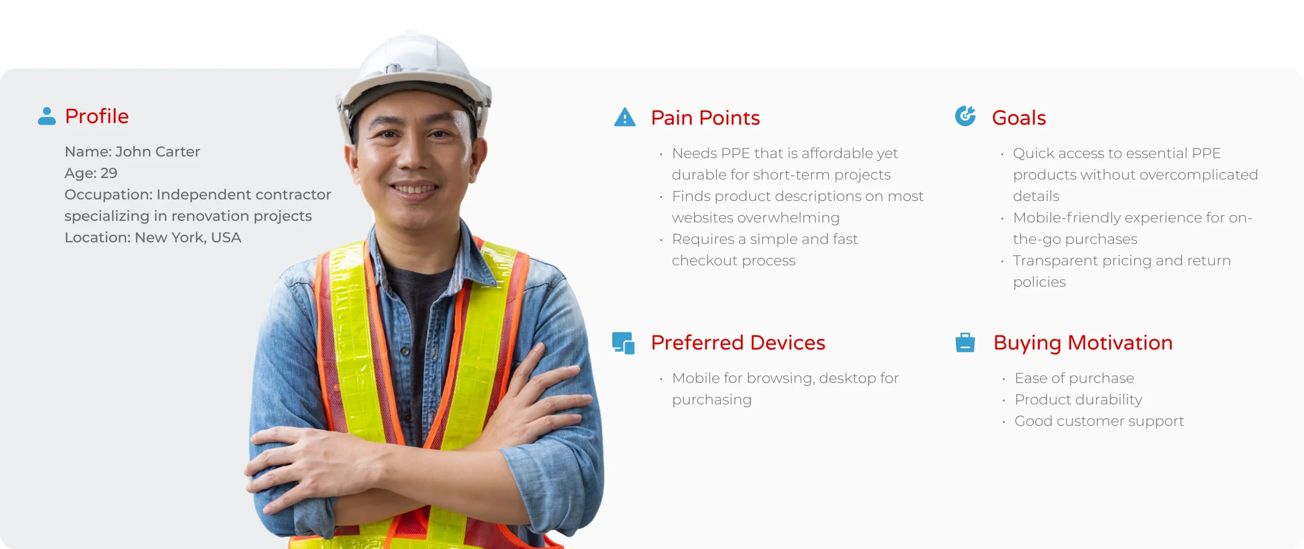
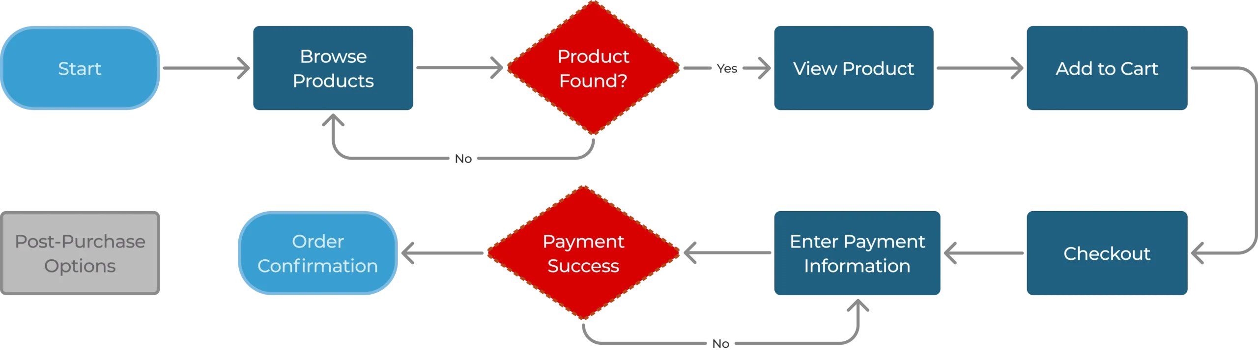
Understanding user needs, pain points, and motivations through research and observation.
Synthesizing insights to clearly articulate the problem that needs to be solved.
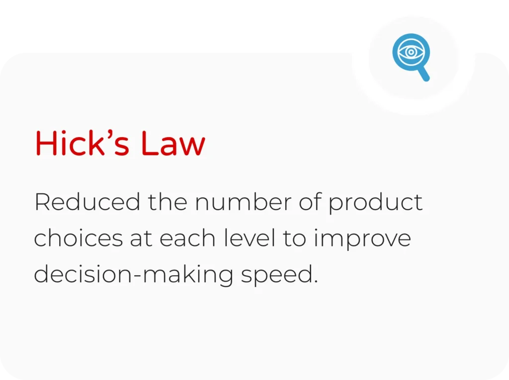
Generating creative solutions and exploring possibilities through brainstorming.
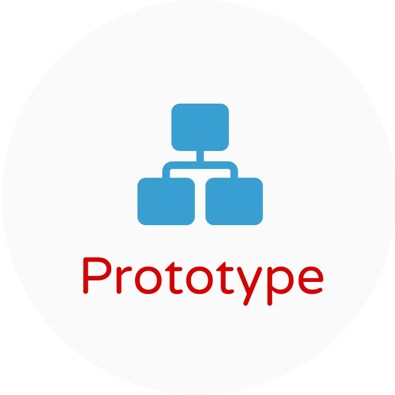
Creating low- to high-fidelity representations to test and refine ideas.
Understanding user needs, pain points, and motivations through research and observation.
Synthesizing insights to clearly articulate the problem that needs to be solved.
Generating creative solutions and exploring possibilities through brainstorming.
Creating low- to high-fidelity representations to test and refine ideas.


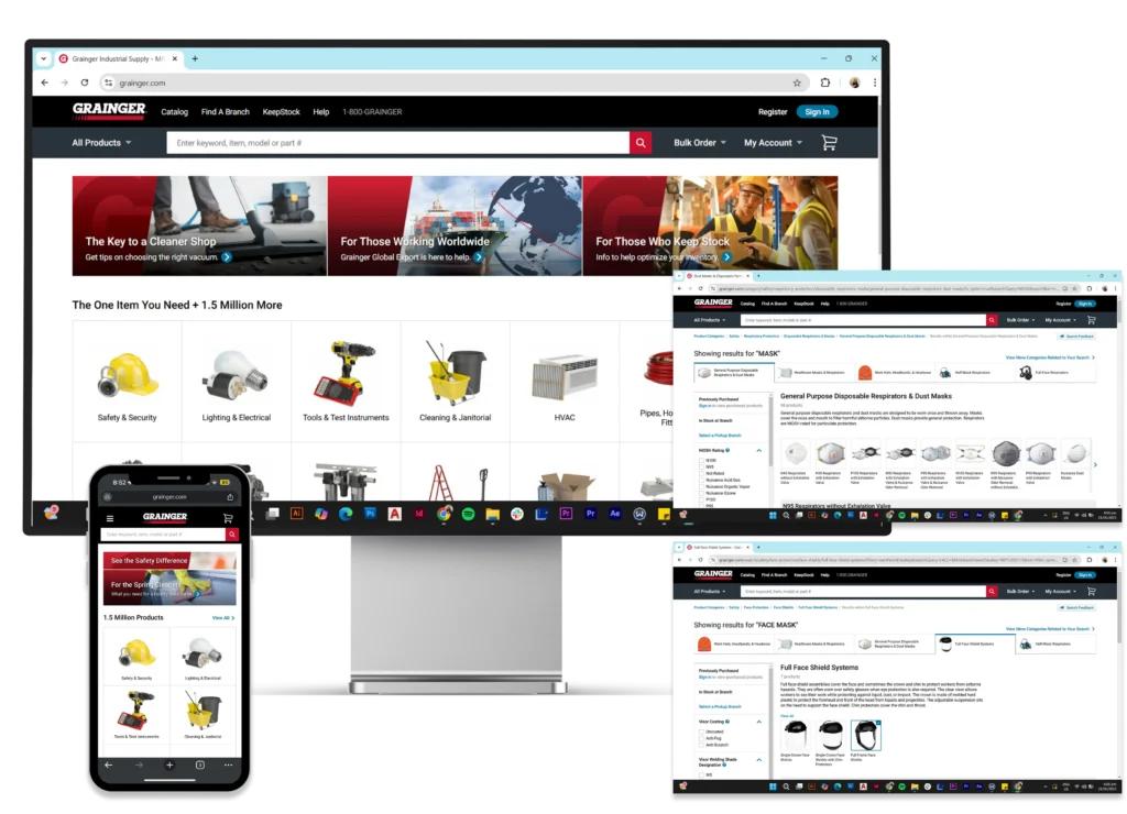
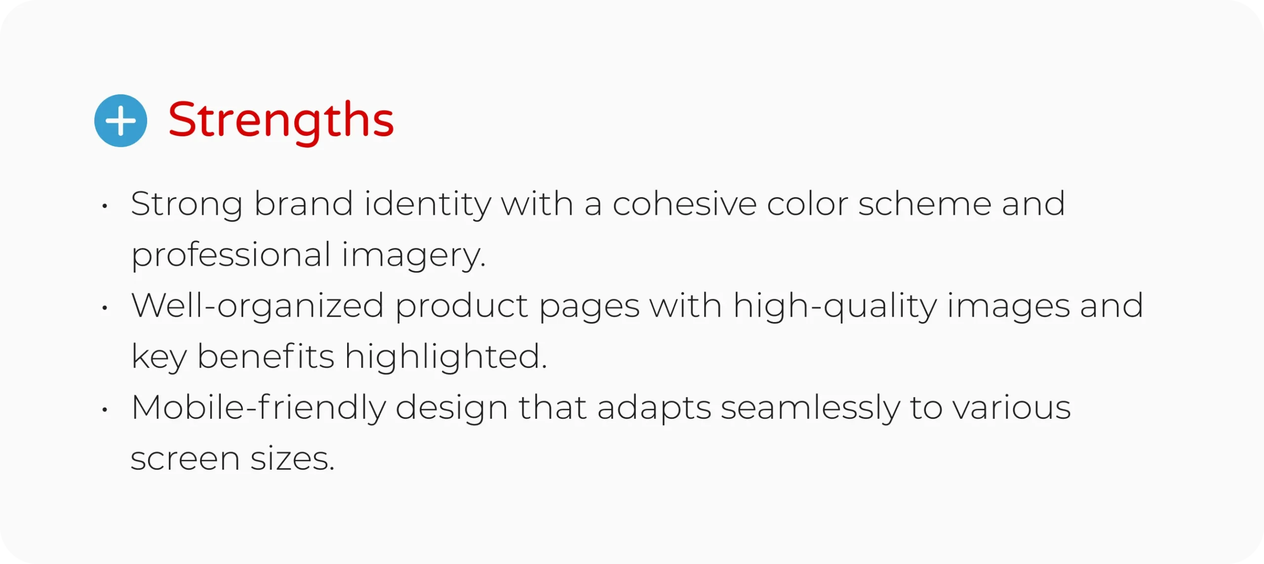
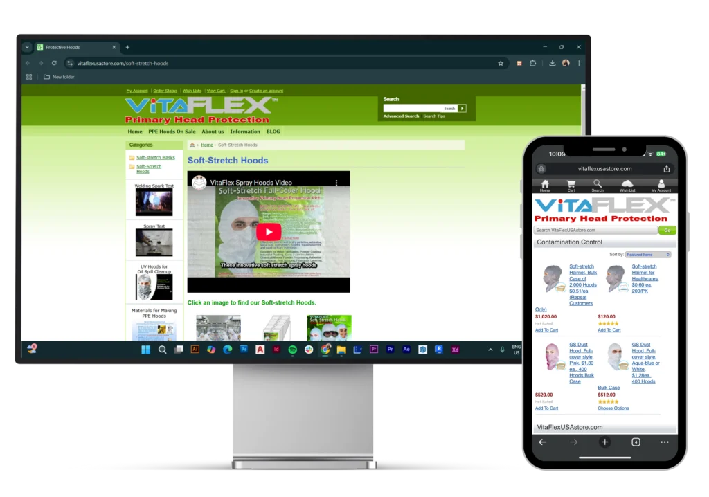
<span data-metadata=""><span data-buffer="">Outdated design with poor visual hierarchy

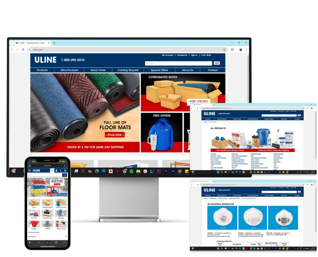
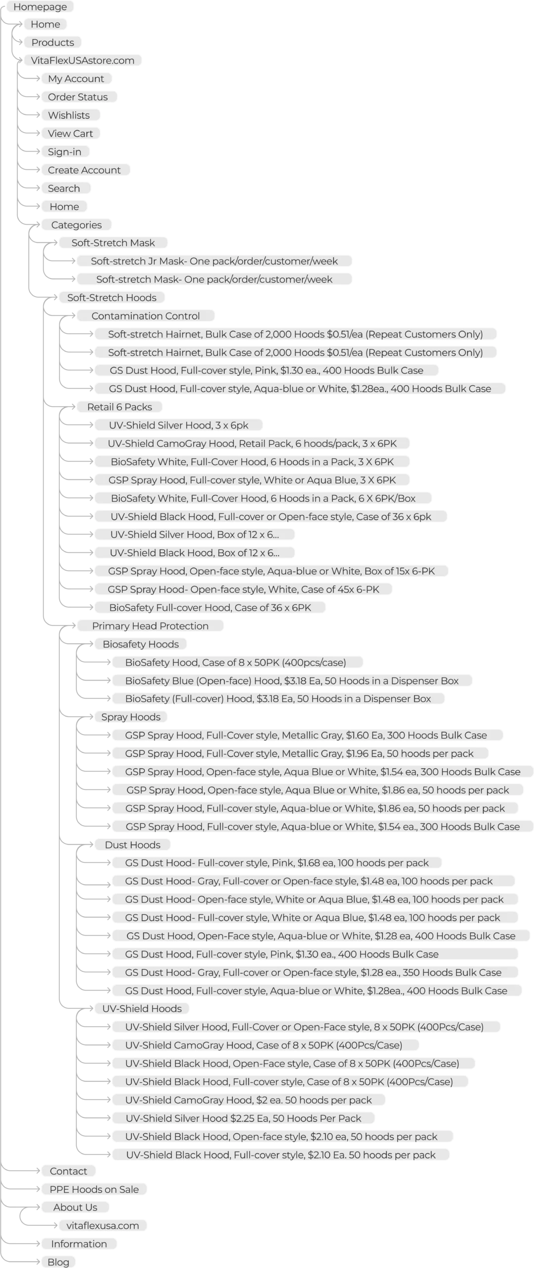
Cluttered layout that made it difficult to find product information

Lack of modern UI/UX best practices

Ineffective call-to-actions (CTAs)

Not optimized for mobile devices
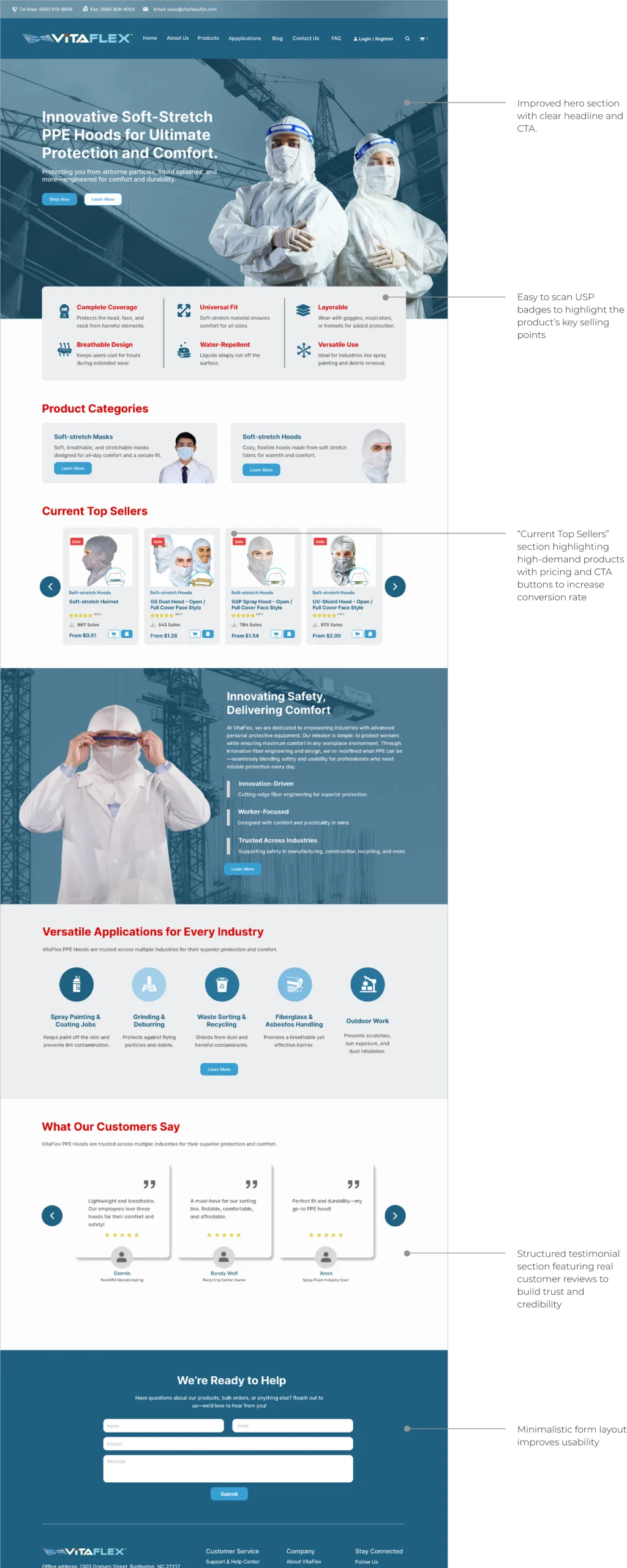
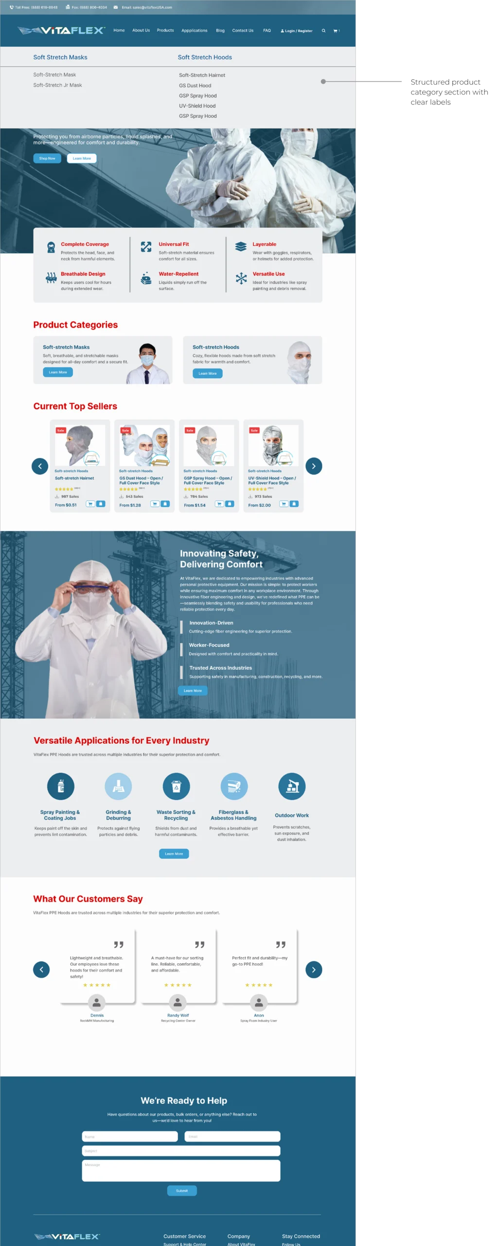
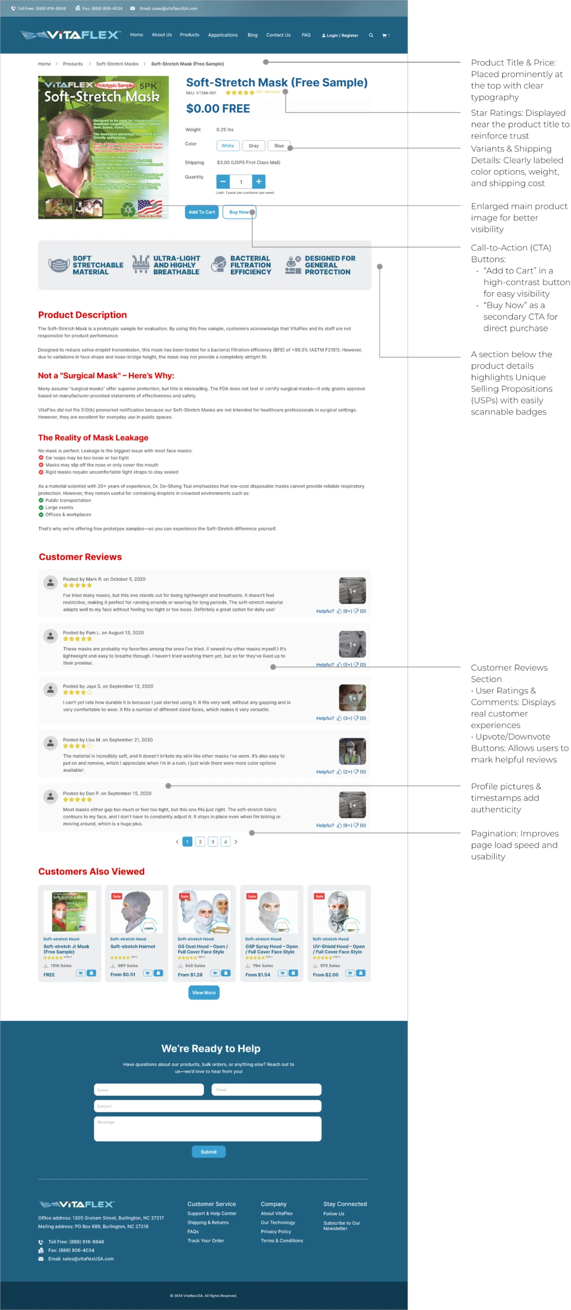
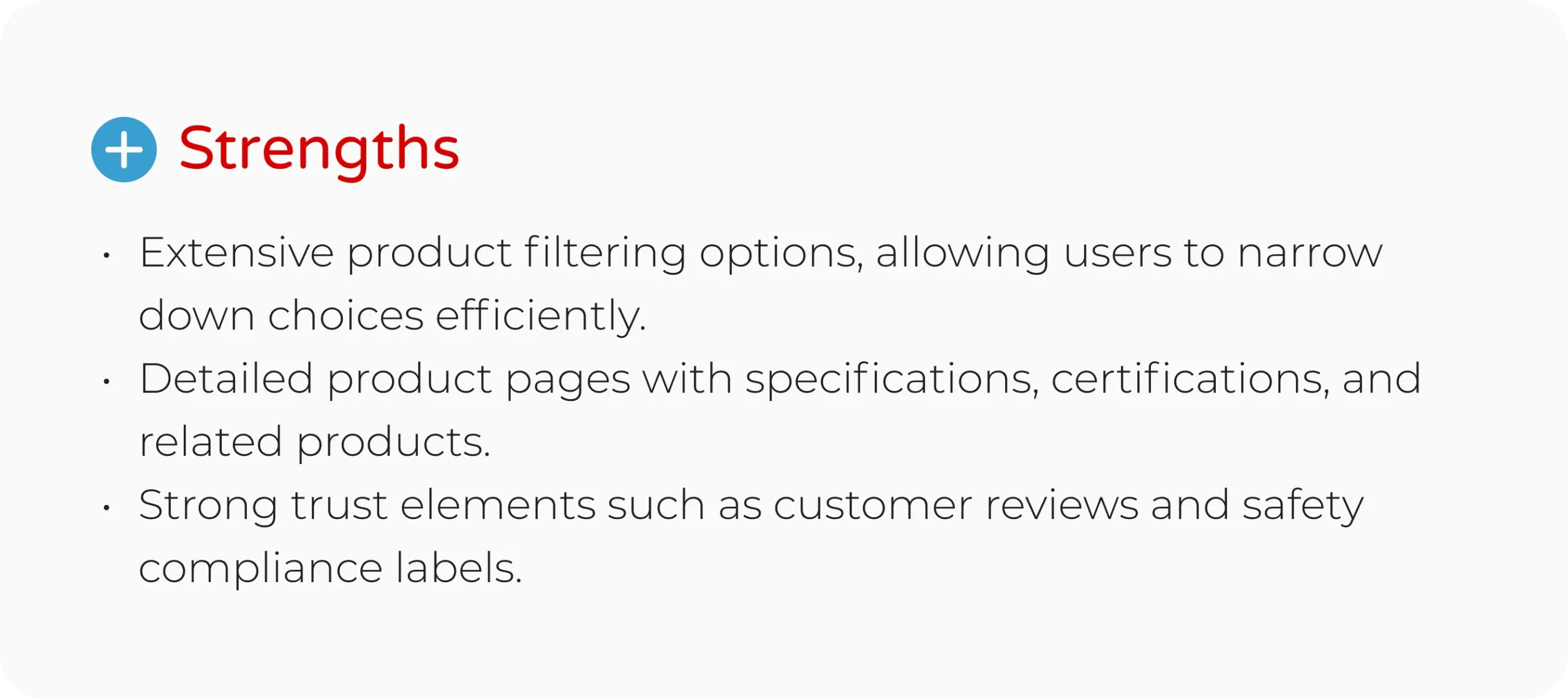
Improve visual appeal and professionalism
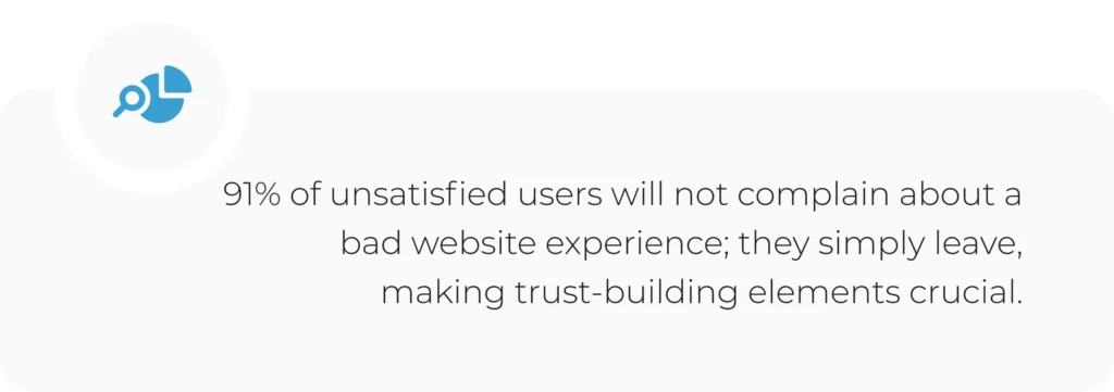
Enhance user navigation and accessibility
Effectively highlight product benefits and categories
Create clear and compelling CTAs to boost conversions
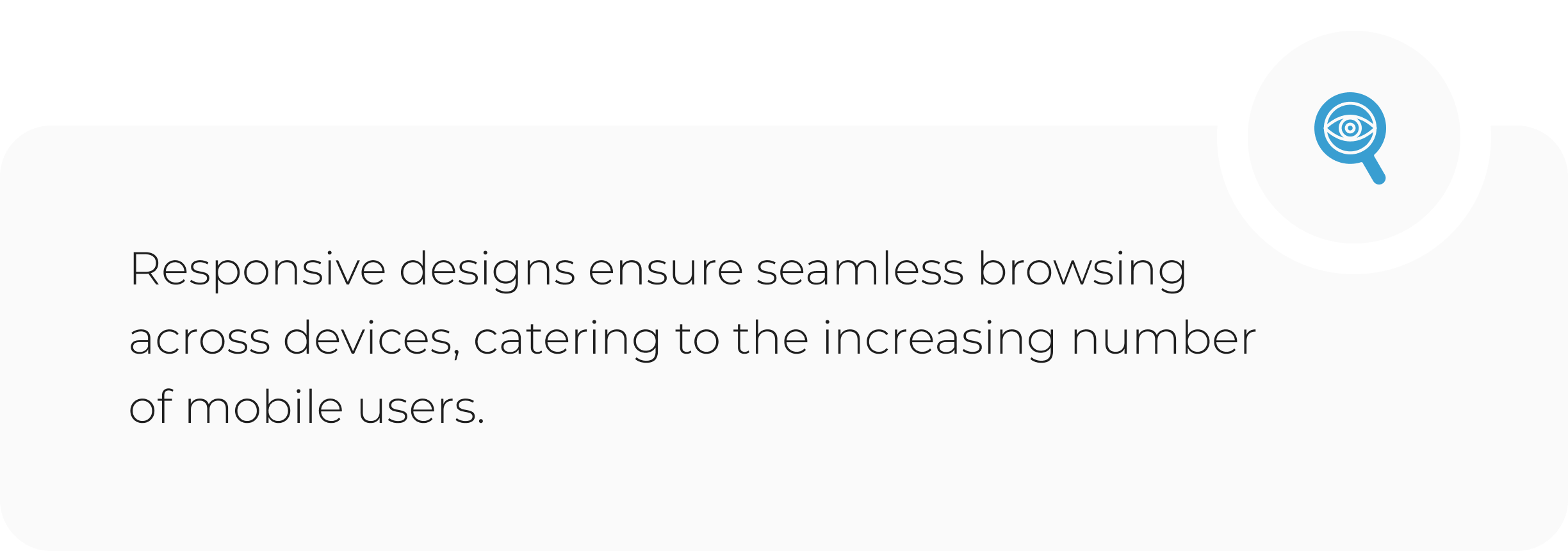
Ensure mobile responsiveness
Outdated design with poor visual hierarchy
Cluttered layout that made it difficult to find product information
Lack of modern UI/UX best practices
Ineffective call-to-actions (CTAs)
Not optimized for mobile devices
Improve visual appeal and professionalism
Enhance user navigation and accessibility
Effectively highlight product benefits and categories
Create clear and compelling CTAs to boost conversions
Ensure mobile responsiveness
<span data-metadata=""><span data-buffer="">Outdated design with poor visual hierarchy
Cluttered layout that made it difficult to find product information
Lack of modern UI/UX best practices
Ineffective call-to-actions (CTAs)
Not optimized for mobile devices
Improve visual appeal and professionalism
Enhance user navigation and accessibility
Effectively highlight product benefits and categories
Create clear and compelling CTAs to boost conversions
Ensure mobile responsiveness


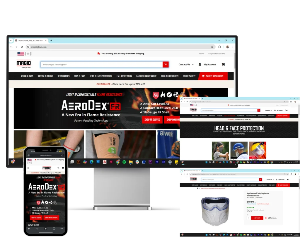


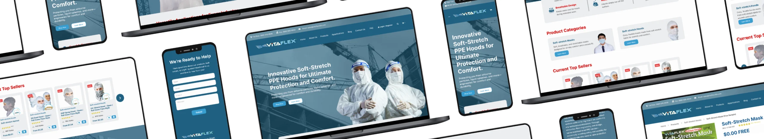
Improve visual appeal and professionalism
Enhance user navigation and accessibility
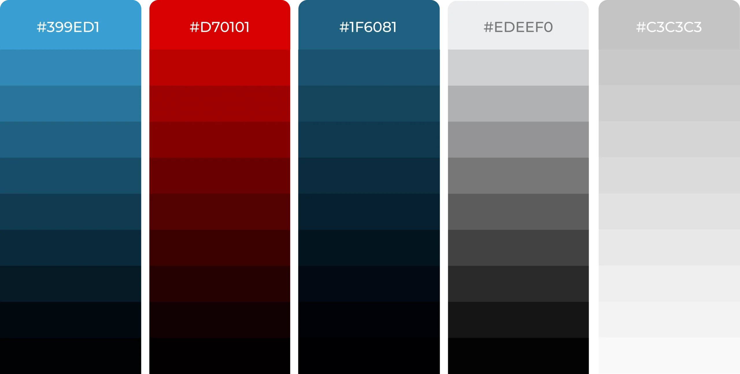
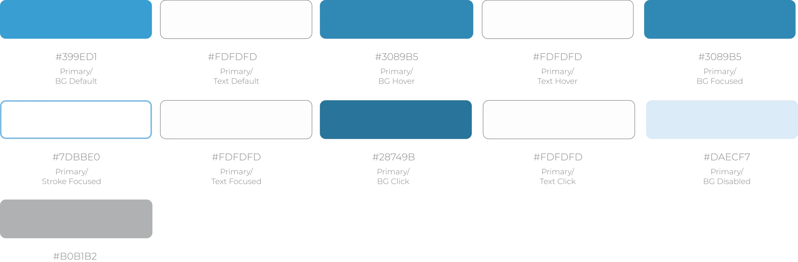
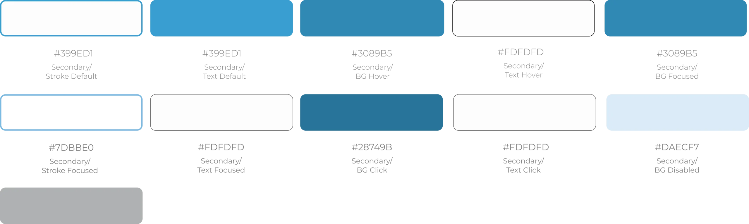
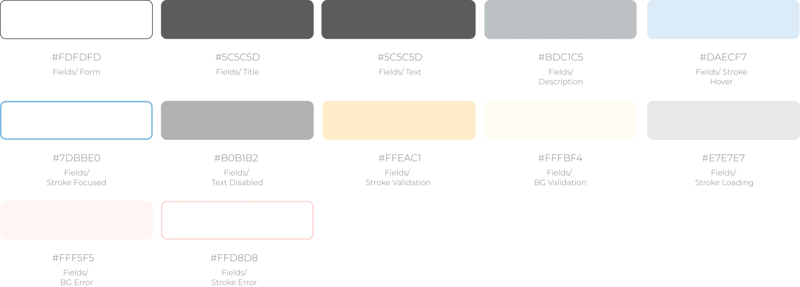
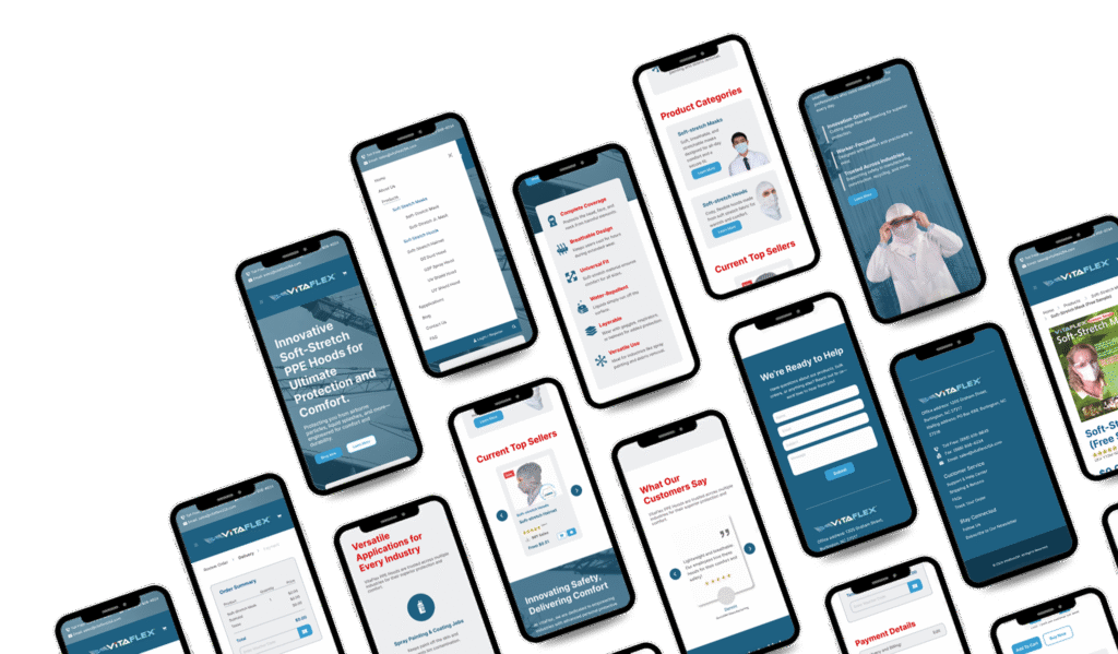
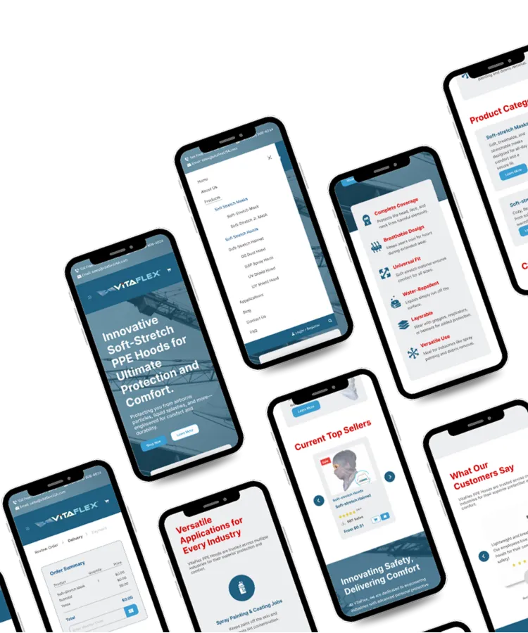
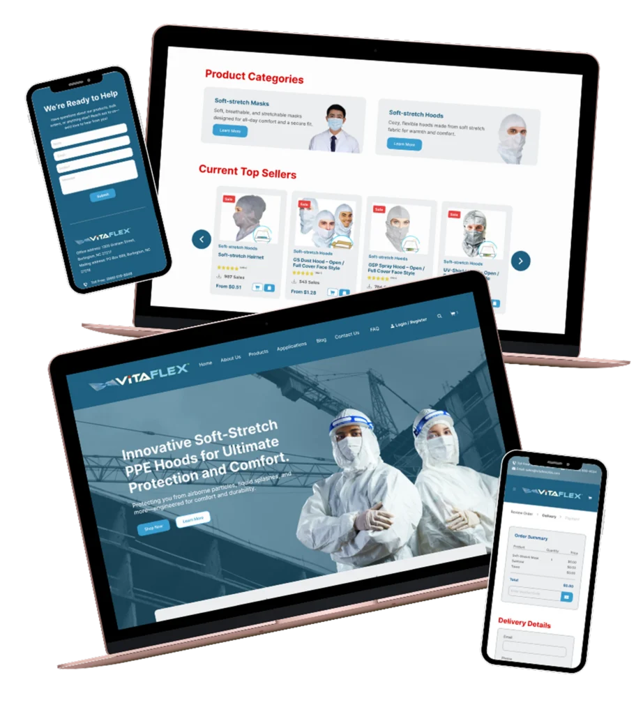
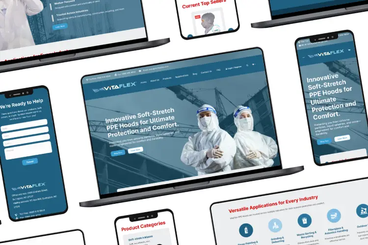
Use a color palette reflecting trust (blue), innovation (green), and safety (red).
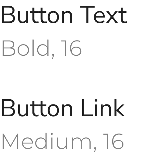
Implement clean, modern typography to enhance professionalism.
Showcase VitaFlex's innovation story through dedicated content sections.
Improve visual appeal and professionalism
Enhance user navigation and accessibility
Use a color palette reflecting trust (blue), innovation (green), and safety (red).
Implement clean, modern typography to enhance professionalism.
Showcase VitaFlex's innovation story through dedicated content sections.