LIVING GOOD CANDLE CO. LANDING PAGE REDESIGN CASE STUDY

December 2024- January 2025

Project Overview

Living Good Candle Co. is a Texas-based, Asian woman-owned brand that creates clean-burning beeswax candles with plant-based oils. While their original landing page featured valuable content, it lacked structure, hierarchy, and clarity — making it difficult for users to browse, understand product offerings, or take action.

I was brought in to redesign the landing page with the goals of improving the user experience, streamlining product discovery, and aligning the visuals more closely with the brand’s calming, eco-conscious identity.

Type: UI/UX Design

Tools Used: Figma, Shopify

Role: UI/UX Designer

TAGS

Design Process

Discovery & Feedback

Reviewed the original website to identify UX friction points. Discussed business goals with the client, including boosting engagement and strengthening the brand’s online presence. Incorporated feedback through multiple design iterations.

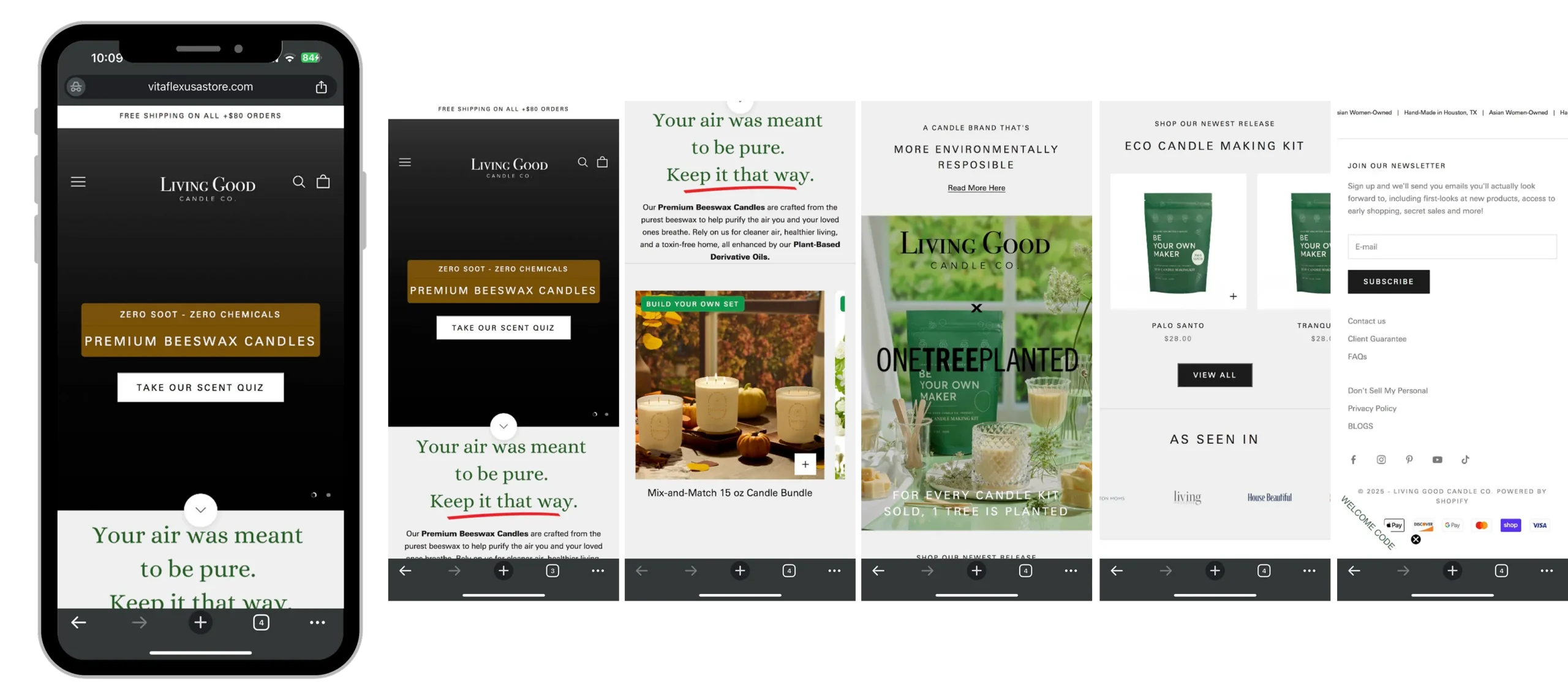
Wireframing & Layout Planning

Planned a scroll-based layout that tells the brand story clearly while promoting featured products and creating natural points of conversion.

Visual Design

Built a clean and modern visual system using soft neutrals, balanced spacing, and calming typography. Applied consistent styling to images, buttons, and components for a polished brand presence.

Iteration & Refinement

Refined typography, spacing, and component layouts across desktop and mobile. Adjusted content order and section emphasis based on client feedback and usability considerations.

Discovery & Feedback​

Problem Statement

The original landing page included important brand and product content but suffered from a lack of hierarchy and structure. It did not guide users through the page effectively or support browsing and conversions. Key product highlights, social proof, and CTAs were either buried or poorly styled, limiting user engagement.

Problem

Content blocks lacked visual hierarchy, making the page hard to scan

Product offerings were not clearly explained or visually supported

There was no clear structure guiding users through the page

Trust signals such as reviews and press features were easy to overlook

Layout lacked consistent spacing and mobile responsiveness

Key product categories were not highlighted or easy to access

Objectives

Create a clear visual hierarchy to improve readability and content flow

Use visuals and concise messaging to better explain product offerings

Structure the layout to guide users naturally from top to bottom with clear CTAs

Surface trust elements to build credibility and user confidence

Apply consistent spacing and design across devices for a responsive experience

Feature product categories like bundles and best sellers to support conversion

Visual Design

High Fidelity Design

After refining the wireframes, I developed the high-fidelity UI designs, ensuring a clean, modern, and user-friendly interface.

UI Design

Results & Impact

The redesign helped the client present their brand with greater clarity and confidence. The new layout made it easier for users to browse and understand product offerings, while improved trust elements and mobile responsiveness contributed to a stronger online presence. The client reported more positive feedback from site visitors and appreciated the structure and flexibility of the new design.

Let’s Work Together

Whether you’re starting a new venture or elevating your brand, I’d love to help bring your vision to life.

I’m here to answer your questions, understand your goals, and explore how we can work together on something meaningful.

hello.monalyssa@gmail.com

Based in the Philippines